
BUMBERSHOOT
Each labor day weekend, over 80,000 people flock to Seattle for one of the biggest music and arts festivals in the Pacific Northwest.
Improve a
Legacy ApP
THE CHALLENGE
Bumbershoot’s current app displays an overwhelming amount of information and generally doesn't make use of the mobile platform’s location services. There is a significant opportunity to build a more optimized mobile experience for festival goers.
TEAM
Marissa Hui, Dana McGinnis,
Joshua Darlington, Tran Truong
MY ROLE
Shared: User Research, Comparative Analysis, Persona Development, Wireframes, User Testing
Owned: Branding, UI Design
TOOLS
Sketch, Illustrator, Axure, Flinto,
Photoshop, Pen & Pencil
DURATION
2-week sprint
THE SOLUTION
A Personalized
Mobile festival guide
In this concept project, we learned from festival goers what works well and what could be improved about the current mobile experience. We redesigned the Bumbershoot app with personalized navigation and schedule planning features, making it indispensable for future attendees.


Research

USER RESEARCH
User Interviews
To fully understand what festival-goers need in a mobile app, we began with user interviews. We conducted interviews with 7 people between the ages of 24-28 who have been to Bumbershoot or a similar festival in the past, many of which had experience using a festival app.
AFFINITY MAPPING
We organized all of our interview data into an affinity map that revealed a strong and almost unanimous need for following mobile features:
-
Festival schedule and with personalization option
-
A desire for live event status updates
-
A need to navigate the festival and easily find amenities and venues

PERSONA
Meet zoey
Using the information gathered through research, we created two personas. Below is our primary persona, Zoey, who embodies our users' highest priority needs.

Age 25
Lives in Seattle, WA
From Austin, TX
UW Grad Student, Public Health
TECH HABITS
High technology and mobile phone use, iPhone, Desktop
PREFERRED APPS
google maps, instagram, facebook
ATTENDS FESTIVALS
occasionally with friends
MOTIVATION FOR ATTENDING
she wants to see a few artists she likes, take a break from school, and explore Seattle
PAIN POINTS
-
Not familiar with festival layout and has trouble finding the closest food, vendors, bathrooms, stage locations, phone charging stations etc.
-
Wastes time searching through artists and events she's not interested in seeing
-
Doesn't like waiting in long lines
For a user like Zoey, it is difficult to distinguish what each pin is for on the map. Filtering can only happen one at a time and the list is very long and cumbersome to scroll through.


Current App

Planning
SITEMAP
Simple App navigation
focuses on Schedule,
map, and event updates
Users can navigate to any section of the app, including their personal schedule through the main global navigation dropdown.

Feature Brainstorm
& Sketching
One of the major features we streamlined for Zoey was the schedule design. We white-boarded as a team to build a layout and hone in on key features:
-
lineup carousel
-
integrated event status updates
-
intuitive favoriting system
-
filtering by event category
-
event/artist cards that link directly
to their location on the map -
social media sharing


Design, Test, Iterate
DESIGN
IN-APP MAP INTERFACE
My solution for clear festival mapping evolved from a comparative analysis of apps that also rely on mapping and have a variety of amenities and venues for users to locate.


TOMORROWLAND
APP INSPIRATION
Toggles allow for totally custom map based on Zoey’s interests and needs
DISNEY WORLD
APP INSPIRATION
Intuitive bold icon-based
map filters are great for
quick scanning in a busy
festival environment
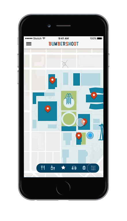
BUMBERSHOOT WIREFRAME
Incorporated filtering/toggles and bold icons into our new
map interface
BUMBERSHOOT
HI-FI MOCK-UP
After receiving user feedback confusing the filter bar with a global nav, we adjusted the bar to float over the map
Interactive MAP
Filtering
By selecting any combination of filters, Zoey can create a totally custom map experience. Each pin can also be tapped to learn more about the location or check which event is live at a venue.
PROTOTYPE
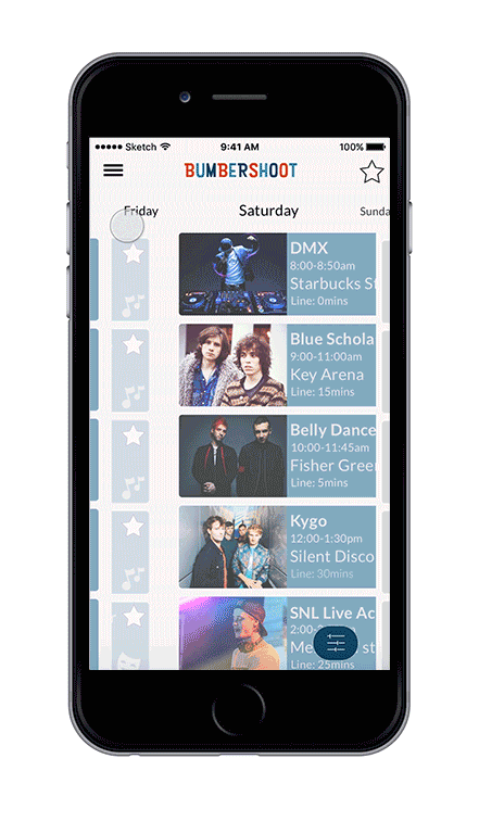
Schedule Viewing and Building
The festival schedule can be easily navigated through swiping in any direction. Stars on the right hand side of each card can be selected to add them to a personal schedule so that users don't have to scroll through events they are not interested in attending.
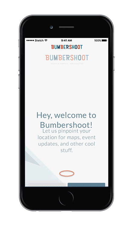
Simple On-boarding to enable Location Services
The on-boarding process is prompted when the user downloads and opens the app for the first time. We designed the experience to be as quick and clear as possible so that the user understands the benefits of allowing permissions.

User testing of our interactive wireframes and prototype revealed a number of ways we could improve the flow of the app, especially by simplifying wording, changing some of our filter icons to feel more intuitive, and adding more color/contrast in the map.
User Testing

BEFORE

AFTER
STREAMLINING ONBOARDING
“There is a lot of text.”
“I don’t want to read it even though it probably has important information”
-
shorter, clearer text
-
Changed NEXT to OK
-
Added SKIP option
-
Added animated location
pin icon to help with quick understanding
A Fresh Look
Bumbershoot's legacy branding from 2016 was a bit dated and busy, especially for someone young like Zoey who is used to cleaner design trends. I chose a PNW-inspired color palette and updated the brand to be clean and modern, but still playful.


